Real-Time Sentiment Dashboards for Product Teams
Build dashboards that show user mood as it happens, not weeks later in reports. Monitor sentiment at scale and respond before problems escalate.
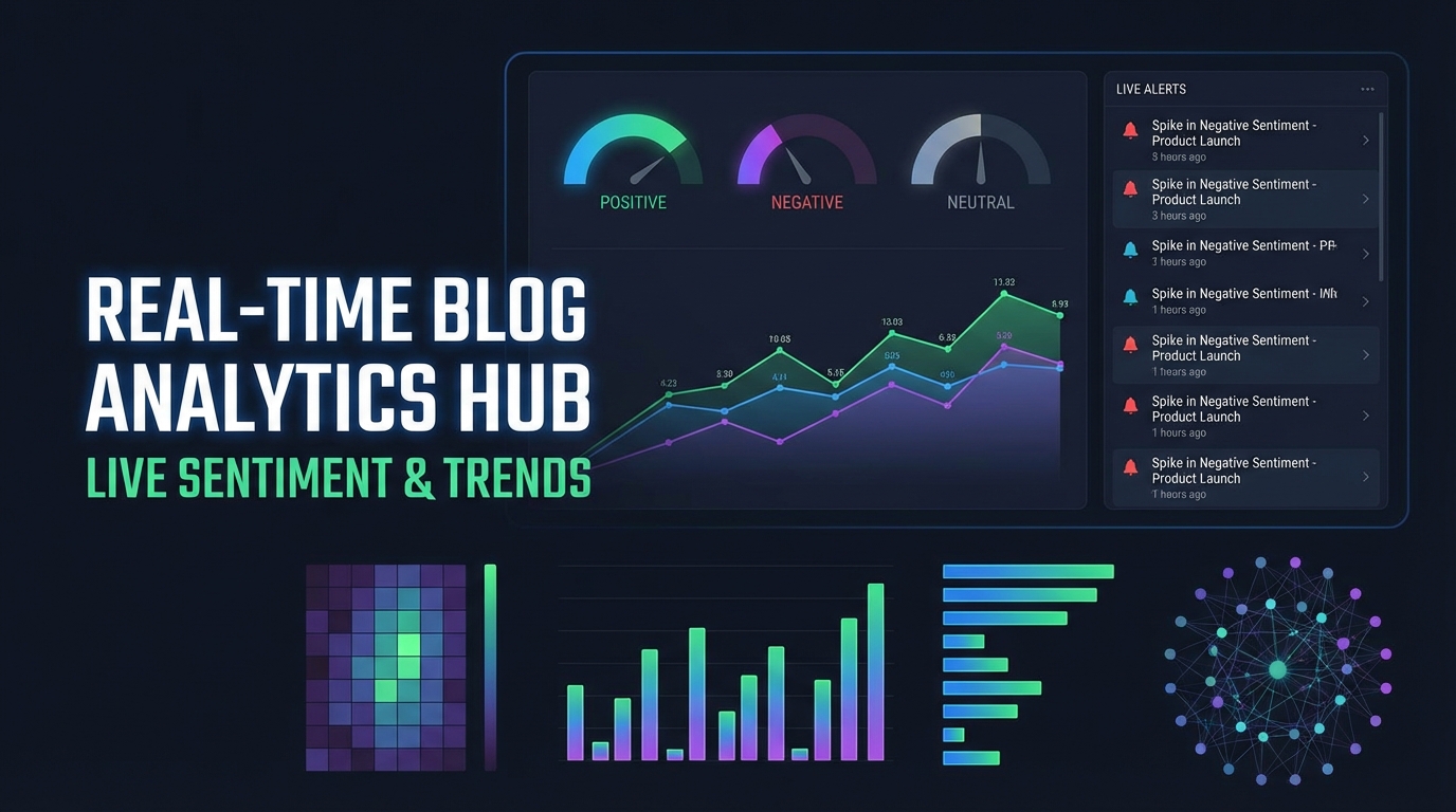
Summary
Traditional feedback analysis happens in batches—weekly reports, monthly reviews, quarterly NPS summaries. But user sentiment changes in real-time, and waiting for reports means missing opportunities to address issues before they escalate. Real-time sentiment dashboards give product teams immediate visibility into user mood, enabling rapid response and proactive management. This guide covers how to build, implement, and act on real-time sentiment monitoring.
The Case for Real-Time Sentiment
Delayed feedback analysis creates preventable problems.
What You Miss with Batch Processing
When sentiment analysis runs weekly or monthly:
Issue escalation: A bug ships Monday, causes frustration Tuesday through Thursday, and you learn about it Friday. By then, ten users have churned and fifty are annoyed.
Missed opportunities: Users express delight with a new feature, but by the time you read about it, the moment for asking for testimonials has passed.
Pattern blindness: Daily fluctuations smooth out in weekly averages. A feature that delights in the morning but frustrates in the evening looks "neutral" in aggregate.
Real-Time Advantages
Immediate visibility enables:
- Rapid response: Address issues within hours, not weeks
- Moment capture: Act on positive sentiment while it's fresh
- Pattern detection: See time-of-day, day-of-week, and geographic patterns
- Release monitoring: Watch sentiment shift as deployments roll out
Architecture of a Sentiment Dashboard
Real-time dashboards require specific technical foundations.
Data Pipeline Design
[Feedback Sources] → [Stream Processing] → [Sentiment Engine] → [Dashboard]
       ↓                     ↓                    ↓                  ↓
   Surveys              Aggregation           Scoring            Alerts
   Support              Windowing             Trends            Visualization
   In-app               Filtering             Anomaly           Actions
Key Components
Data ingestion layer:
- Webhook receivers for survey responses
- Event stream consumers for in-app signals
- API integrations for support platforms
- Social media listeners (if relevant)
Processing layer:
- Stream processing for real-time aggregation
- Windowed calculations (5-minute, hourly, daily)
- Filtering and enrichment
- Anomaly detection
Storage layer:
- Time-series database for metrics
- Document store for raw feedback
- Cache for current state
Presentation layer:
- Real-time dashboard updates
- Alert notification system
- Drill-down capabilities
- Export and sharing
Latency Requirements
For effective real-time monitoring:
| Metric Type | Target Latency | Why |
|---|---|---|
| Individual feedback | Under 1 minute | Enable rapid response |
| Aggregate scores | Under 5 minutes | Show emerging trends |
| Trend calculations | Under 15 minutes | Support pattern recognition |
| Alerts | Under 2 minutes | Enable timely intervention |
Essential Dashboard Metrics
Not all metrics belong on a real-time dashboard. Focus on actionable signals.
Primary Sentiment Indicators
Current sentiment score:
- Real-time aggregate of recent feedback
- Typically shown as a gauge or prominent number
- Color-coded (green/yellow/red) for instant recognition
- Comparison to historical baseline
Sentiment velocity:
- Direction and speed of sentiment change
- More actionable than absolute score
- Alerts when velocity exceeds thresholds
Volume by sentiment:
- Count of positive, neutral, negative feedback
- Absolute volume matters—10 negative responses in a day might be normal, 100 might indicate a problem
Segmented Views
Real-time sentiment becomes more actionable when segmented:
By user segment:
- Enterprise vs. SMB vs. individual
- New users vs. established users
- By industry or use case
By product area:
- Feature-specific sentiment
- Workflow or journey stage
- Support topic categories
By source:
- In-app feedback vs. support tickets vs. surveys
- Different sources have different signal characteristics
Trend Indicators
Time-based comparisons:
- Current hour vs. same hour yesterday
- Current day vs. same day last week
- Week-over-week trend direction
Moving averages:
- Smooth out noise while maintaining recency
- 24-hour moving average for daily patterns
- 7-day moving average for weekly patterns
Alert Configuration
Real-time data without alerts is just a pretty display.
Alert Types
Threshold alerts:
- Sentiment drops below X
- Negative volume exceeds Y per hour
- Score change exceeds Z in W minutes
Anomaly alerts:
- Sentiment deviates significantly from expected
- Unusual patterns detected
- Feedback volume spike
Trend alerts:
- Sustained downward trajectory
- Accelerating negative velocity
- Recovery detection (for closed-loop tracking)
Alert Hierarchy
Not all alerts are equal. Implement severity levels:
| Severity | Criteria | Response |
|---|---|---|
| Critical | Score below 30, rapid decline | Immediate team notification, incident response |
| High | Score below 50, declining trend | Same-day investigation required |
| Medium | Score below 60, below baseline | Review within 24 hours |
| Low | Minor fluctuation | Logged for pattern analysis |
Alert Fatigue Prevention
Too many alerts means no alerts get attention:
- Implement cooldown periods after alerts fire
- Group related alerts into single notifications
- Auto-resolve when conditions return to normal
- Weekly alert quality review—remove noisy alerts
Dashboard Design Best Practices
Effective dashboards balance information density with clarity.
Information Hierarchy
Level 1 (glanceable):
- Overall sentiment status
- Alert count/severity
- Trend direction Visible from across the room, tells you if you need to pay attention.
Level 2 (summary):
- Segment-level scores
- Recent trends
- Volume metrics Visible from your desk, provides context.
Level 3 (detail):
- Individual feedback items
- Drill-down analysis
- Historical comparisons Requires active investigation.
Visual Design Principles
Use color consistently:
- Green always means positive
- Red always means negative/attention needed
- Yellow always means caution/neutral
Show context:
- Every number needs a comparison point
- Absolute values need historical baselines
- Current state needs trend direction
Enable action:
- From any metric, path to take action should be clear
- One click to investigate
- Two clicks to intervene
Real-Time Updates
Visual feedback for updates:
- Subtle animation when numbers change
- Clear indication of data freshness
- "Last updated" timestamp always visible
Appropriate refresh rates:
- Critical metrics: Every 30 seconds
- Summary metrics: Every 2-5 minutes
- Trend charts: Every 5-15 minutes
Operationalizing the Dashboard
A dashboard nobody watches is worthless.
Viewing Routines
Daily standup check:
- Review overnight sentiment summary
- Check for alerts that fired
- Identify investigation priorities
Continuous monitoring:
- Dashboard on team display/TV
- Designated watcher during high-risk periods
- Post-deployment monitoring routine
Weekly review:
- Trend analysis across the week
- Pattern identification
- Dashboard refinement discussions
Response Protocols
Define clear actions for different dashboard states:
Normal (green):
- No action required
- Look for improvement opportunities
- Celebrate wins
Caution (yellow):
- Investigate root cause
- Monitor more closely
- Prepare for potential intervention
Alert (red):
- Immediate investigation
- Designated owner assigned
- Resolution timeline established
- Status updates until resolved
Integration with Workflows
Dashboard insights should flow into existing processes:
Into development:
- Critical issues create tickets automatically
- Sentiment spikes attached to relevant feature bugs
- Trend reports included in sprint planning
Into support:
- Sentiment-weighted ticket prioritization
- Proactive outreach for negative sentiment users
- Support team visibility into product issues
Into success:
- At-risk user identification
- Health score integration
- Renewal risk early warning
Advanced Capabilities
Once basics are solid, add sophistication.
Predictive Sentiment
Use historical patterns to forecast:
- Expected sentiment for next 24 hours
- Deviation from predicted = potential issue
- Seasonal adjustments (Monday mornings always lower, etc.)
Correlation Analysis
Automatically identify relationships:
- Sentiment drops correlate with deployment times?
- Feature usage correlates with satisfaction?
- Support response time affects sentiment?
Natural Language Insights
Surface key phrases driving sentiment:
- "Most mentioned positive": "easy to use", "fast", "helpful"
- "Most mentioned negative": "confusing", "slow", "broken"
- Trending phrases: phrases increasing in frequency
Cohort Comparisons
Compare sentiment across meaningful groups:
- New features users vs. established users
- Different onboarding paths
- Account sizes or industries
Implementation Roadmap
Build your sentiment dashboard incrementally.
Phase 1: Foundation (Week 1-2)
Focus: Basic visibility
- Single sentiment score
- Simple trend line
- Manual refresh
Validates: Data pipeline works, basic metrics meaningful
Phase 2: Segmentation (Week 3-4)
Focus: Actionable detail
- Segment-level breakdowns
- Source differentiation
- Basic alerting
Validates: Can identify where problems originate
Phase 3: Real-Time (Week 5-6)
Focus: Speed
- Automatic updates
- Low-latency processing
- Alert optimization
Validates: Can respond to issues quickly
Phase 4: Intelligence (Ongoing)
Focus: Insight
- Anomaly detection
- Correlation analysis
- Predictive capabilities
Validates: Dashboard provides unique value beyond raw data
Common Pitfalls
Dashboard Overload
More data isn't always better. Every element should answer: "What action does this enable?"
Remove metrics that are:
- Interesting but not actionable
- Redundant with other metrics
- Never referenced in decisions
False Precision
Real-time updates can create illusion of precision. A sentiment score of 67.3 vs 67.1 is noise, not signal. Design dashboards to show meaningful changes, not decimal fluctuations.
Ignoring Context
A sentiment drop during a major release is expected. During a normal Tuesday, it's concerning. Build context awareness into interpretation.
Dashboard as Destination
The dashboard shows status; it shouldn't be where you live. If team members spend hours staring at the dashboard, something is wrong with alert configuration or response protocols.
Key Takeaways
- Batch processing creates blind spots: Real-time visibility enables rapid response
- Architect for latency: Design your pipeline to support sub-minute feedback processing
- Alert wisely: Too many alerts means no alerts get attention
- Design for action: Every metric should have a clear response path
- Operationalize viewing: Establish routines for dashboard monitoring
- Start simple, add sophistication: Basic visibility first, intelligence later
User Vibes OS provides real-time sentiment dashboards with intelligent alerting and seamless integration into your workflows. Learn more.
Related Articles
Email Drip Campaigns Triggered by User Sentiment
Build smarter nurture sequences that respond to how users actually feel. Use sentiment signals to send the right email at the right moment.
Building a Voice of Customer Program That Actually Influences Roadmap
Learn how to systematically collect, organize, and present user feedback so product decisions are data-driven. Includes stakeholder buy-in strategies.
The User Journey Lifecycle: A Framework for Continuous Feedback
Discover the 9-stage user journey lifecycle for collecting feedback from attract to recapture. Build products users love with continuous insights.
Written by User Vibes OS Team
Published on January 15, 2026